The Hidden Meaning Behind 10 Streetwear Logos
See how these streetwear brands got their symbols.
A logo is a simple image that can instantly evoke the essence of an entire brand and company at a glance. The power to be influential and publicly recognizable without the aid of words is invaluable, and even more so in the realm of fashion. Particularly, in streetwear, where common wardrobe staples — think coach jackets, pocket tees and 5 panels caps — are often used as blank canvases for designers to flaunt their creativity, a suitable logo can leave a lasting impression if presented in the right way. With many brands’ roots entrenched in graphic T-shirts, a logo has the pivotal role of putting a fledgling brand at the forefront of the market in its early stages, and without a memorable design… well, it probably wouldn’t make for a compelling T-shirt release. While the big brothers of streetwear such as The Hundreds and its Adam Bomb mascot, Supreme — and its Barbara Kruger-inspired logo — and A Bathing Ape (and its tongue-in-cheek reference to spoiled youths bathing in lukewarm water) have been heard many times before, here, we skip through the list, bringing to light the story of 10 streetwear logos from both established and fledgling brands; uncovering the real meaning behind their guise.
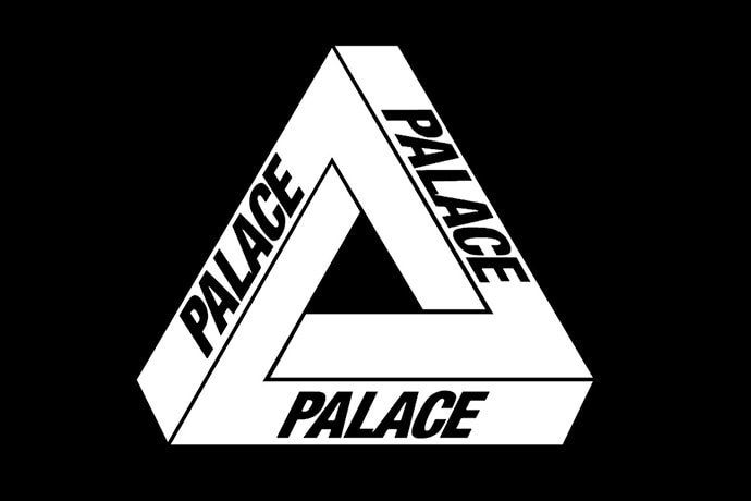
Palace Skateboards
Year: 2010
Palace Skateboards was founded in 2010 by Lev Tanju, but its fundamentals were set during the mid 2000s under the monikier PWBC. Its aesthetic is inspired by a ’90s nostalgia that has seeped through onto its apparel designs and lo-fi skate videos which are often edited with satirical news clips. Featuring a Penrose triangle adorned with italized “Palace” type on its three sides, the label has been worn by anyone from local Southbank skaters, SoHo socialites to household name rappers like Drake. Designed by Swedish artist Oscar Reutersvärd in 1934, the shape is an impossible object and a type of optical illusion that sees no definitive end. The Palace logo titled “the Tri-ferg,” however, was envisioned by Fergus Purcell, celebrated British illustrator who has straddled in both the underground and mainstream realms, producing designs or his own skate label Aries along with Marc Jacobs. According to Purcell, “Lev said it’s going to be all about triangles, which he subsequently completely forgot that he said.” 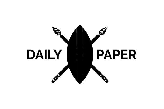
Daily Paper
Year: 2010
Daily Paper is an Amsterdam-based menswear label making waves for its contemporary fare. The logo depicts a shield and is inspired by the founders’ origins in Africa. A modern interpretation of the Maasai shield, the shield is known for blurring the lines between utilitarian craft and fine art. According to co-founder Hussein Sulelman, the logo “represents multiple things: Protecting everything you love by all means necessary, the founders’ African heritage and the philosophy of being modern nomads where mobility is the most efficient strategy for exploiting scarce resources.” 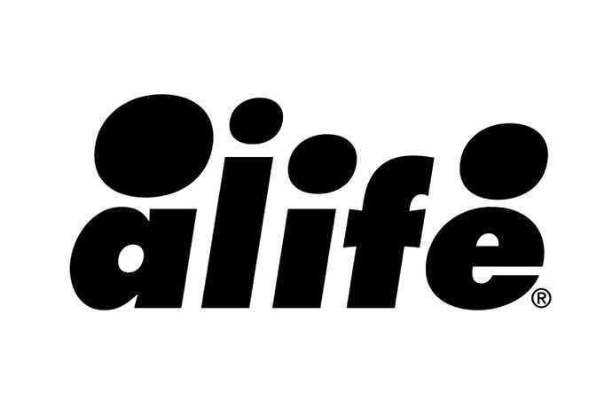
Alife
Year: 1998
Alife was an idea conceptualized by four individuals with the aim to open a creative workshop and retail experience. The four founders knew fully well how important a logo was, and with their goal in mind, needed to have a symbolic icon for their movement. The logo itself was envisioned by Rob Jest, one of the founders who had a background in graffiti. Jest’s creations were known for its large size and readability, and these design elements were translated into the logo for Alife. According to Jest, “the Alife identity needed to incorporate the four partners whom created this new concept in retail/agency/gallery operation, hence the four circular dots above the letters. These dots represented each of the founders, [while] the logo also needed to be powerful to the point of being able to read no matter what size it was being viewed. I chose a classic font, Futura and ended up going bold and italicized as to give it movement.” 16 years after the brand’s inception, Alife’s logo has become recognized worldwide, and has sat beside some of the biggest imprints in our culture. 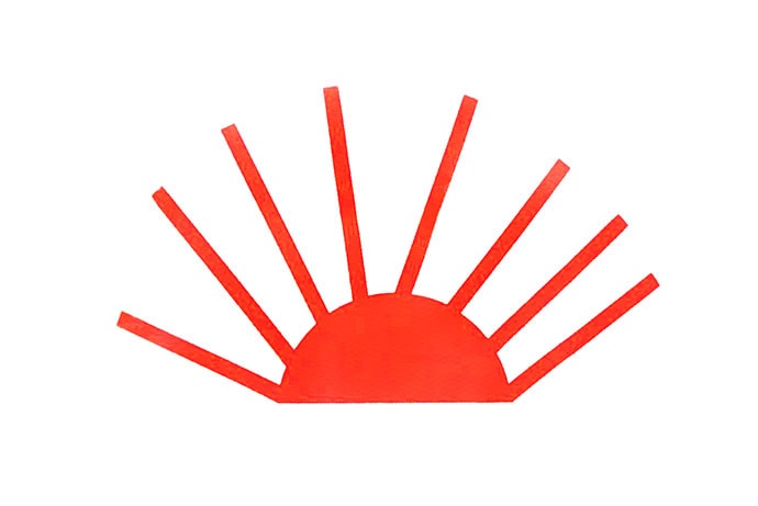
Gosha Rubchinskiy
Year: 2008
Gosha Rubchinskiy exploded on the street-meet-runway scene, inspired by the aesthetic of his Russian youth, with pieces that exude a sense of nostalgic innocence. Its also made headlines for street casting models as young as 13, aiding in this youthful outlook. One of the brand’s recognizable logos — alongside Gosha Rubchinskiy’s name in Russian Гоша Рубчинскийis — is the Pассвет (Russian for sunrise) and is also known as the “Eternal Sun,” a simple graphic often depicted in red. It’s inspired by rebirth and new beginnings, and takes from the radical sensibilities of nonconformist artist Timur Novikov. Additionally, the logo is also references the late-’80s punk music scene in Soviet Russia’s Leningrad. An ode to the new wave of Russian street fashion, the logo took the runway by storm in the brand’s 2015 spring/summer offerings for Paris Fashion Week. 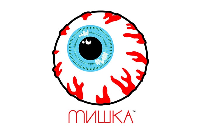
Mishka
Year: 2003
Mishka, like many other streetwear brands, started off with T-shirt printing. Founded by Mikhail Bortnik and Greg Rivera, МИШКА has since grown into a lifestyle brand with its own niche culture. Mishka’s logo includes the Cyrillic/box logo, and was designed by Bortnik himself. The box logo is simply Mishka in Cyrillic, where Mishka was one of Bortnik’s nicknames in his native Russia. The eyeball however, was designed by Miskha’s first ever intern — Mike Jones. Jones worked his way up to art director over several years, and amiably named the eyeball logo the “Keep Watch Eye.” It fits into Mishka’s provocative approach to streetwear with its tongue-in-cheek references that riff on a blend of hip-hop, graffiti and punk. 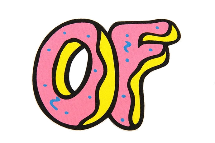
Odd Future
Year: 2007
Odd Future (or OFWGKTA) is an American hip-hop collective founded by Tyler, The Creator and his cohort both past and present: Frank Ocean, Earl Sweatshirt, Hodgy Beats, and more. Its logo is simply the brand’s abbreviations depicted as cartoon donuts in bright pink and yellow. There’s no denying Tyler’s love for donuts, he’s previously rapped “We go skate, rape sluts, and eat donuts from Randy’s.” When the success of his music parlayed onto fashion, the donut graphic as the crew’s emblem was a no-brainer, perfectly representing the youthful and carefree aesthetics of the group. Tyler, The Creator envisioned the logo, as he used to draw donuts on his pants as a 15 year old in an effort to differentiate himself. He mentions the donut logo in “Oldie” (“Um, I was 15 when I first drew that donut, 5 years later, for our label yea we own it.”) The symbol stuck, and now you can’t go down Fairfax without seeing a dozen donuts printed across socks and tees. 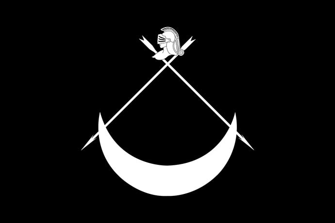
Black Scale
Year: 2007
Black Scale was founded a few years ago and has become another staple streetwear brand hailing from California. The Black Scale logo depicts a crescent moon, and above it, crossed arrows with a knight’s armored helmet above it. The logo draws inspiration from medieval designs, with elements inspired by motifs that would appear on a coat of arms. Michael “Mega” Yabut, the brand’s founder, wanted Black Scale’s logo to be a “protector of the brand.” According to Yabut, “the knight is the protector of the brand, the arrows is the weapon to protect and the moon represents the shield.” 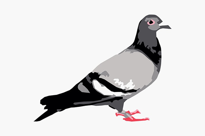
Staple Design
Year: 1997 jeffstaple’s Staple Design brand started off as a one-man T-shirt business in New York City, and its Pigeon logo is inspired by the city and its hustle mentality. When jeff was envisioning a logo, he wanted to incorporate an animal because he admired brands that were able to “own” one and be immediately connected to it. He thought that the pigeon would be an appropriate icon as it represented New York City, undeniably intertwined in the fabric of the Big Apple. However, it’s was also relatable to residents of other cities because pigeons are everywhere. Additionally, the pigeon embodies a street mentality of getting something through whatever means — illustrated by the way it survives and succeeds. 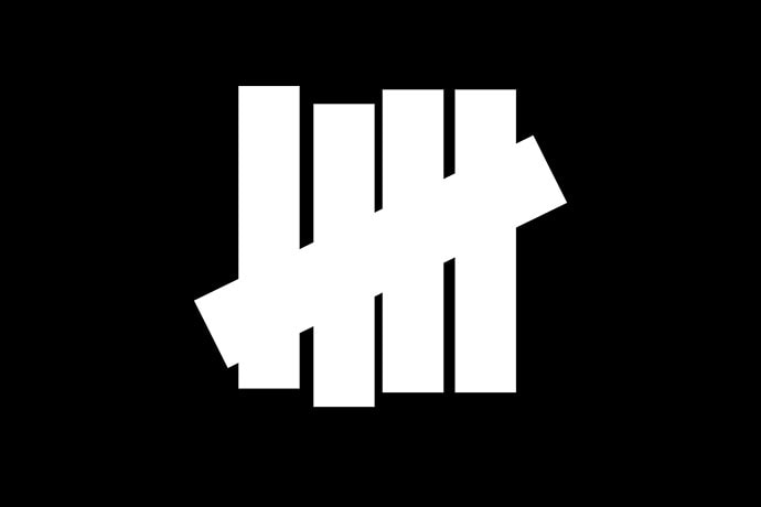
Undefeated
Year: 2002
Premium California sneaker boutique Undefeated is no new name to streetwear and footwear. Its coveted collaborations – with the likes of adidas, Been Trill and A Bathing Ape — along with its in-house label continues to place the brand at the forefront of its genre. Its “5Strikes” logo was designed by Adam Levite. The aim of the logo was to fully encompass the word “Undefeated” with something that would be as bold as its name but simple enough to remember. The result was five strikes, a measurement for counting which also represents how the brand also conquer its opponents; winning five straight games in a row and walking away. It was also inspired by the World War II Allied fighter kill count. 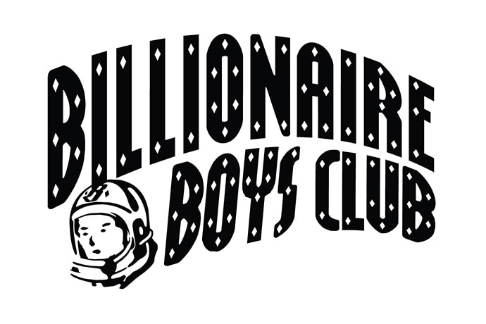
Billionaire Boys Club
Year: 2005
In 2005, Pharrell Williams teamed up with the Japanese fashion stalwart Nigo and founded Billionaire Boys Club. The brand is inspired by the understanding that education is one of the biggest gifts in life, and that learning and discovering things should be striven for as human beings. Williams didn’t want the “Billionaire Boys Club” name to be misunderstood, as it isn’t meant to evoke a sense of superiority or privilege. Ironically, it’s meant to incite an inquisitive nature in people, and to push them to pursue their dreams regardless of money. Despite that, BBC’s early history saw prices shoot up as demand sorely exceeded supply. Its SK8THING-designed Arch log is fronted by the astronaut/spaceman, and this logo aims to evoke and allude to that sense of exploration and discovery.


