John Geiger's "Misplaced Series" Collab With Lids Is a Full-Circle Moment (No Cap)
Geiger discusses the 12-style collection, his lifelong love of Pirates hats, his signature “Misplaced” design ethos and more.
John Geiger's "Misplaced Series" Collab With Lids Is a Full-Circle Moment (No Cap)
Geiger discusses the 12-style collection, his lifelong love of Pirates hats, his signature “Misplaced” design ethos and more.
“I haven’t been asked where I’m from in a long time, and I think it’s partially because I’m always wearing a Pittsburgh hat,” says John Geiger, a toothy grin spreading across his face. Geiger may split the lion’s share of his time between Tampa Bay and Puerto Rico these days, but he’s still a Pittsburgh kid at heart. There’s always at least one black-and-yellow garment or footwear colorway in his eponymous brand’s drops, and he’s a frequent presence at Pirates, Penguins and Steelers games.
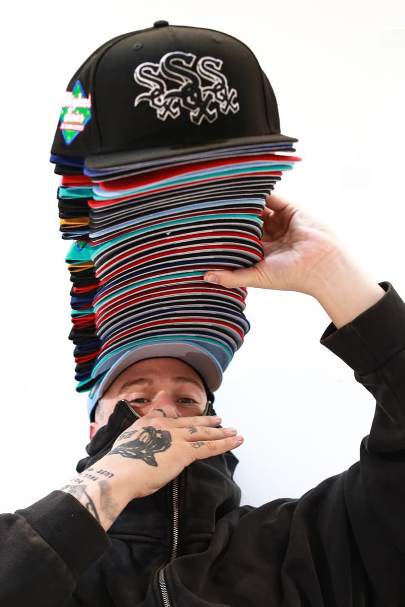
Now, the Steel City kid turned leader of a thriving independent brand is having what may be his most grand homecoming yet: a collaboration with MLB, New Era, and Lids that sees him bring his signature “Misplaced” ethos — think boldly stacked, rapidly repeated logos that create a sort of trompe l’oeil effect — to a nine-team collection of 59FIFTY fitted hats centered around his beloved Pirates. Besides the Pirates, the offerings also spotlight the Marlins, Rays, Phillies, Mets, White Sox, Cardinals, Angels and Rangers, all with tripled-up, tightly stacked logos on the front panels and a custom patch on the side.
Longtime fans of Geiger’s work know that the “Misplaced” ethos dates back to his early work with The Shoe Surgeon on bespoke “Misplaced Checks” Air Force 1s and can also be seen in John Geiger Co. products, but the designer notes that this collaboration opened his eyes to the widespread appeal of the aesthetic. “Working with Lids on this project helped me see that the ‘Misplaced Series’ is almost like universal branding at this point,” he says.
But, before we continue our conversation, a pause is necessitated. “This is the first time I’ve seen everyone with the hats on!” says Geiger, pausing to capture a screenshot of the video chat, which is awash in repeated logos.
Talk us through this collab. How did it come together? Did you know what you wanted to do right away when the opportunity presented itself?
Funnily enough, I had this hat design sitting for a while and was just waiting for the right opportunity to bring it to life — that, and hoping that I wouldn’t see something similar in the meantime [laughs]. When the time came, the only thing we had to do was get the teams on board. Initially, the teams that were going to be included in the capsule were teams in the cities that I’ve lived in, like Pittsburgh, New York, Los Angeles and Tampa Bay, and then it just grew from there.
Altered placement and repetition of logos have long been a part of your design ethos, dating back to the bespoke “Misplaced Checks” Air Force 1s you created in the 2010s. What initially drew you to that design language, and how would you say it’s evolved since then?
It started out small. When I was working with Darrelle Revis and Nike on the Zoom Revis, I got the idea to create a small run of custom Air Force 1s with overlapping checks, and the name “Misplaced Checks” came from the nickname we had for Swooshes in Pittsburgh, “Nike checks,” as well as a bit of a play on the fact that I was receiving consulting checks from Nike at the time. Then, a few years later, I would stack and overlap my own brand’s “JG” wordmark logo on its products.
There was a period when I started to feel like that ethos was played out and I didn’t want to keep using it, but every time we’d work with someone on a collab they’d want to do it, which changed my perspective as I realized it had become our “signature.” I’ve got to say: I was surprised that nobody had done it with MLB logos, because it looks so right with some of the logos and branding, but working with Lids on this project helped me see that the “Misplaced Series” is almost like universal branding at this point.
What’s the significance of a Pirates hat to people in Pittsburgh? What does it mean to them? What does it represent?
Let me just say it like this: I haven’t been asked where I’m from in a long time, and I think it’s partially because I’m always wearing a Pittsburgh hat. I’ve been wearing Pirates hats almost exclusively since 2014 — before that, Don C would send me a lot of Just Don hats from a bunch of different teams, and after that snapback-first era ended I made a conscious decision to represent Pittsburgh. It started with a bunch of different sports teams, but gradually I just started wearing more and more Pirates hats, especially as I grew closer with the organization. I always joke that I don’t have the keys to the city, but I do have the keys to all the sports stadiums.
The fact that I get to rep three different eras of the Pirates in this collaboration, from the Roberto Clemente-era hats to the red-brimmed hats from the early ‘00 — which will be exclusive to our pop-up in Pittsburgh — and the current caps is one of the most meaningful moments of my career.
That’s got to be a full-circle moment.
Absolutely. One of my closets must have 800 Pirates hats in it. As soon as they get a little sweaty, I’ll swap to a fresh one, and it’s crazy to now have my own Pirates hats in there.
You and your Pirates hats are like Dr. Dre and his Air Force 1s.
Exactly [laughs].
Another standout from the collection is the duo of Marlins hats, which make use of the older logo that the team used from its inception in 1993 until they rebranded as the Miami Marlins in 2012. What drove you to chose that historic logo?
It’s both that that’s a classic logo and that Miami feels like a second home to me. I lived out there two times and go back for Art Basel every year. We did two colorways because we wanted one, the teal, to be a Miami exclusive in the same way the red-brimmed Pirates hat was for Pittsburgh.
What team do you think has the most underrated hats in the MLB?
Man … I love that old Marlins logo, so I’d either have to say the Marlins or the Tampa Bay Rays. Their hats, from their founding to now, have always been so solid.
What’s your prediction for the upcoming MLB season?
You could probably have guessed that I’d say something like this, but I do think the Pirates are going to make some noise. Paul Skenes is looking like he might be the best pitcher in baseball, Mitch Keller is sick too, and we’ve got Andrew McCutchen back for another year, which means we’ve got plenty of veteran leadership. Don’t be surprised to see them in the postseason.
The John Geiger x MLB x New Era x Lids collection will release on April 5 at select Lids stores as well as the LidsHD.com. In celebration of the launch, John Geiger will also be hosting a pop-up in Pittsburgh April 5, which will include an exclusive black/red Pirates hat and take place at 20 E General Robinson, across the street from PNC Park.

