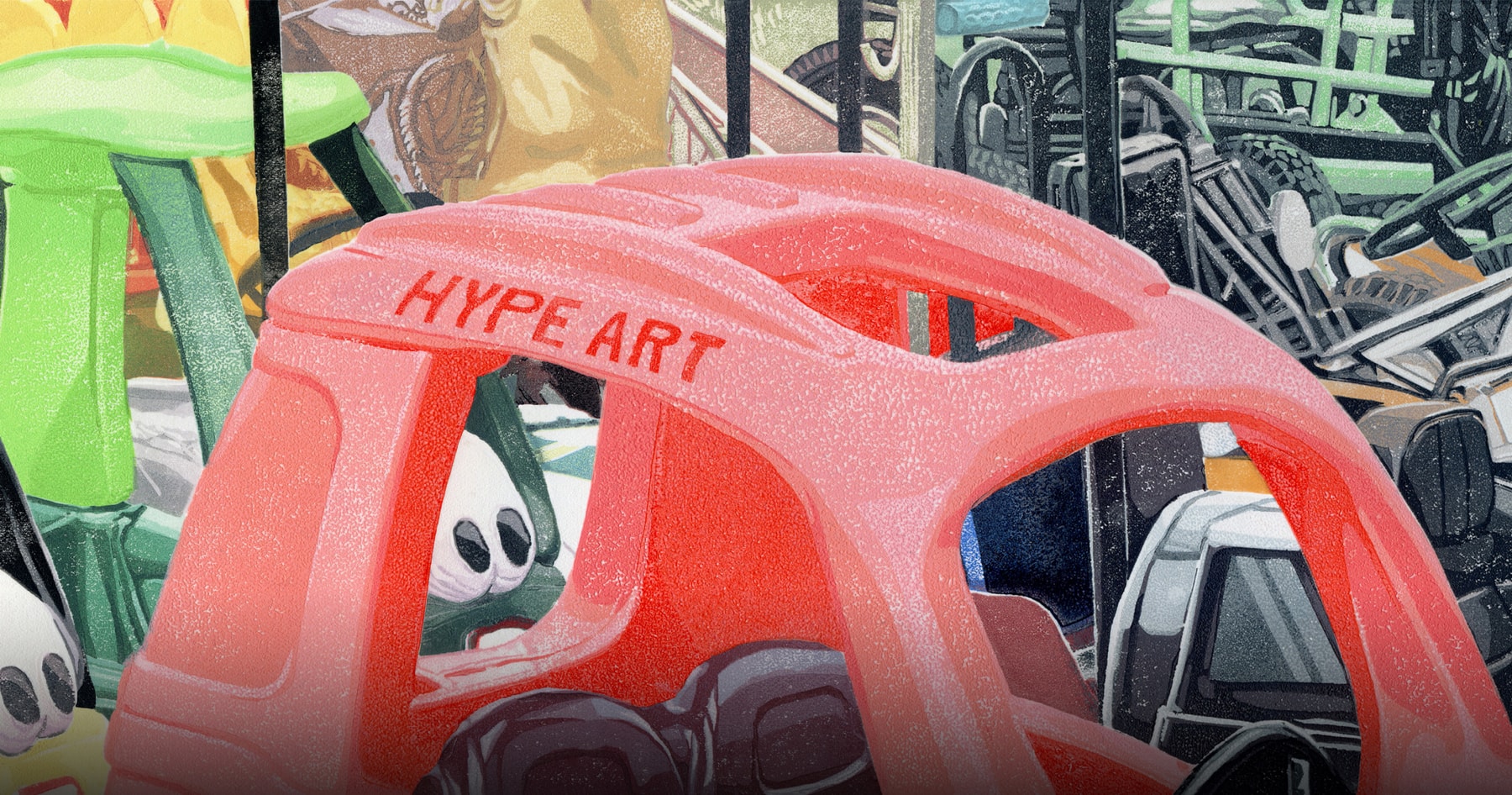

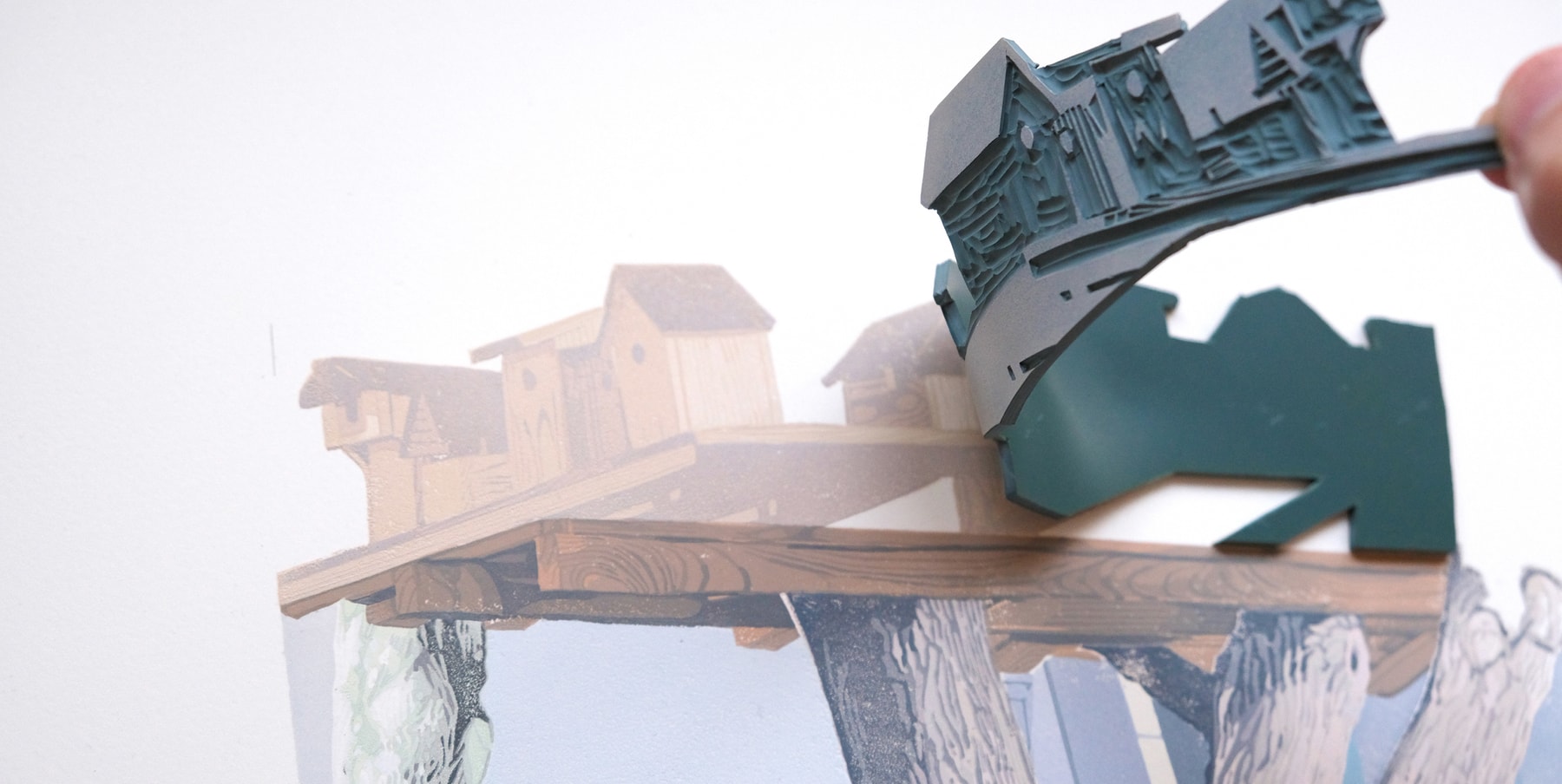
In a social media-driven age that moves frantically fast, artist and printmaker Dan Howden likes to work slow. How slow? His process always begins with taking a photograph, fine tuning that image via Photoshop, projecting it on a wall, then redrawing the core parts with a marker. Finally, he cuts the base elements and assembles them back together, one by one in separate registrations which he rolls over with paint and ink to finish off. Sounds intensive? That’s because it is, but Howden, who’s based in England’s northern city of York, loves his unintended career path.
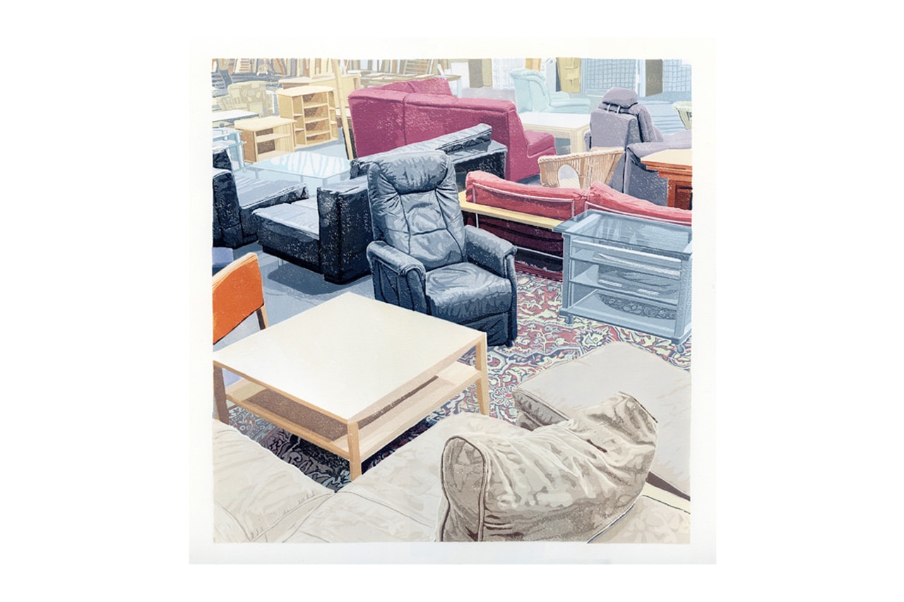
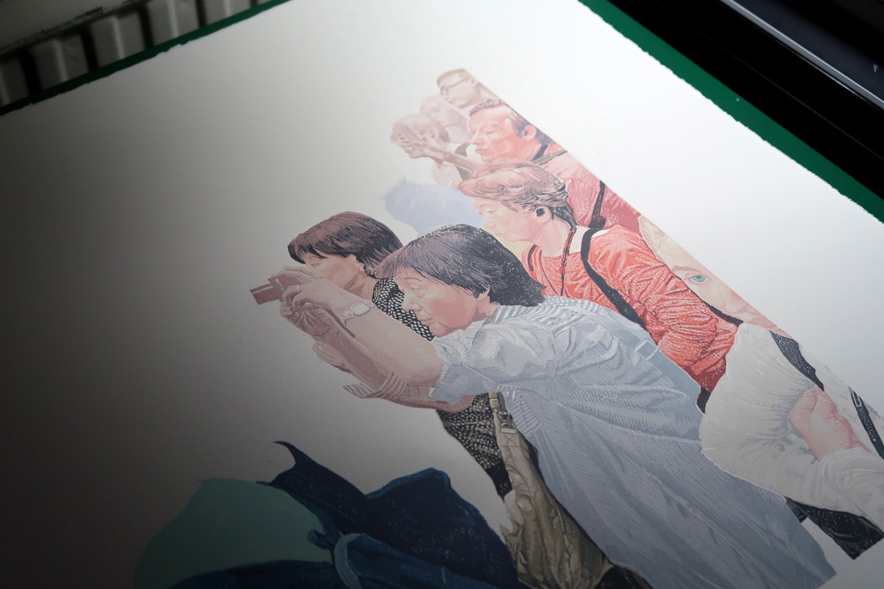
“I occasionally feel like a photographer who’s bizarrely embraced linocut rather than an illustrator who’s adopted photography,” he tells Hypeart. In terms of subject matter, Howden takes a maximalist approach to presenting ordinary observations through vivid fragments of color. Describing it as “a parallel universe,” he takes particular affinity in congested scenes, such as a group of people crammed together in attempts to photograph the Mona Lisa (1503) or furniture spread out across a retail score. “There are times I’ve been in Sports Direct and just stood around, taking in the sheer volume of similar clothing that’s hung up. It leaves me feeling so conflicted,” Howden adds.
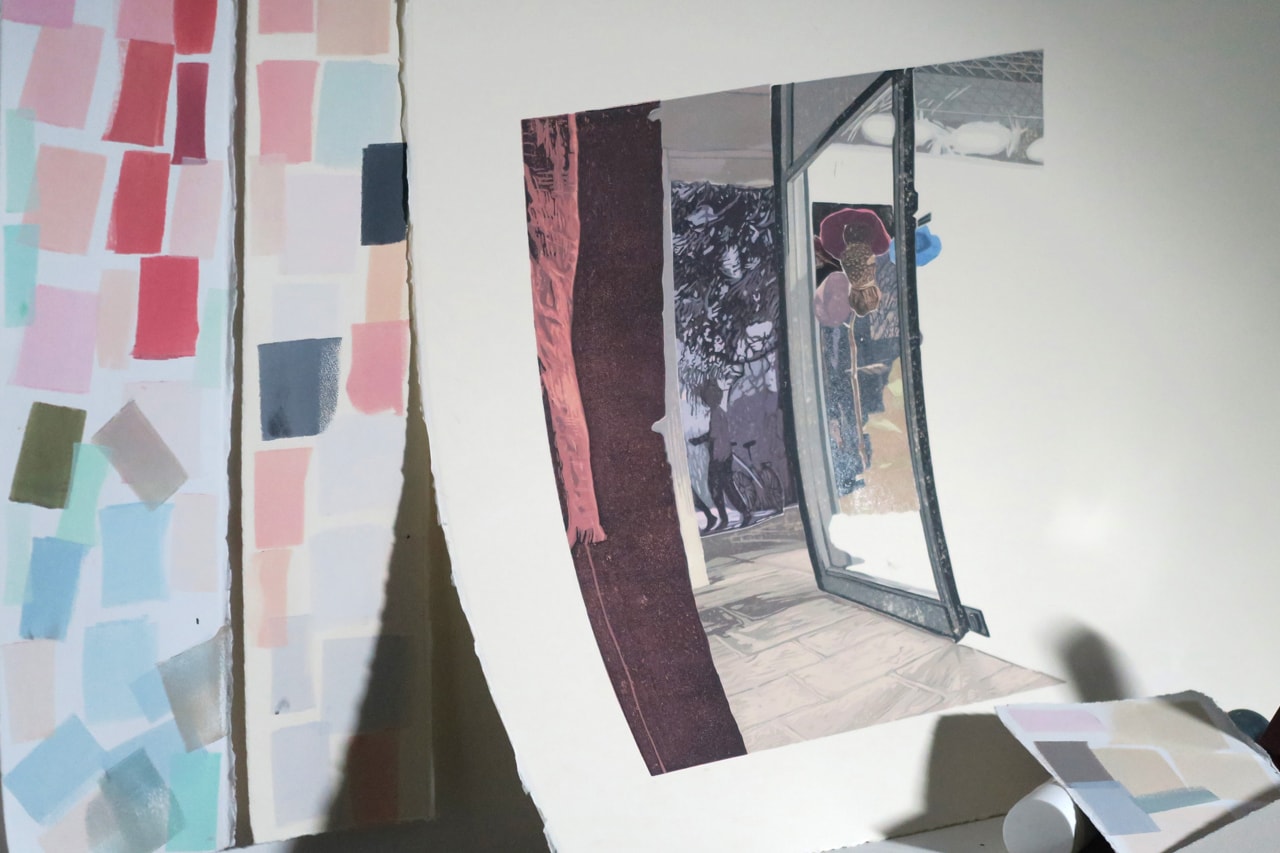
While there really is no rhyme or reason to some of the figurative choices he expands on in his work, there is a clear exploration into color, form and material. One to which he’s developed a masterful command over and distinct visual aesthetic that one could easily mistake for a painting from just a short distance.
In recent times, however, Howden has added a jolt of life to his two-dimensional planes in the form of charming stop-motion animations. Like his prints, the flow of the work deliberately moves at a slower pace to imbue a sense of reflection within the viewer. The series was first conceived during the pandemic, a surreal period in which Howden’s etchings began to unintentionally start resembling the street views from outside his window. “Like a little play being performed outside,” he recalled.
For the latest Pen & Paper, Hypeart caught up with Dan Howden to discuss the nostalgic qualities of his printmaking, along with his newfound interest in animation. Read the full interview below.
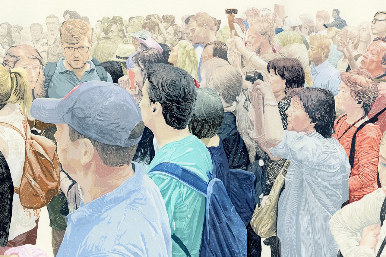
“I’m really interested in saturation and excess.”
Tell me a little about your formative years and the early influences that seep back into your work today?
Like a lot of kids in the early 2000s, my entry point into art was through video games and their packaging. I would read the instruction manuals during long car journeys from front to back, staring at every little illustration. Content was sparse back then and every picture meant so much. It all felt incredibly realistic, but it obviously wasn’t, and that duality left an indelible mark which greatly informs my practice today.
As I started secondary school, I had this innate patience for creative activities, but it never quite extended to learning the intricacies involved. Instead, I would bulldoze in and elect to improvise, often with mixed results, but in doing so, led to a lot of experimentation. I filmed little comedic sketch videos with friends in public spaces and I constructed detailed cardboard advertising hoardings for kickabouts on the field, all in an attempt to add authenticity to what I was doing. Above all else, that veil of realism is the feeling I’ve always tried to capture.
Social media is frantically rapid, whereas linocut printmaking is slow and requires meticulous precision. How did you first gravitate towards this art form and what do you think sets it apart from other mediums, such as drawing or painting?
My introduction to lino was completely arbitrary. A tutor on my foundation course simply suggested it as an alternative to painting – so I took some kit home and intuitively started cutting the linoleum with some scissors to try and include more color. It was hard to cut, but I persisted. It felt like the right thing to do. I did a lot of painting before that but I never understood when to stop and this caused a lot of unnecessary doubt. It’s small, but for all lino’s effort and complexity, I really appreciate its distinguishable end point.
How would you define your own practice?
A lot of my work has a gentle, nostalgic quality which I would attribute to the pastel palette I adopt and the tired and unremarkable subject matter I tend to select. Photography plays a substantial role within my practice, arguably greater than lino does at times. I occasionally feel like a photographer who’s bizarrely embraced linocut rather than an illustrator who’s adopted photography.
Are there any underlying messages or overarching themes you tackle?
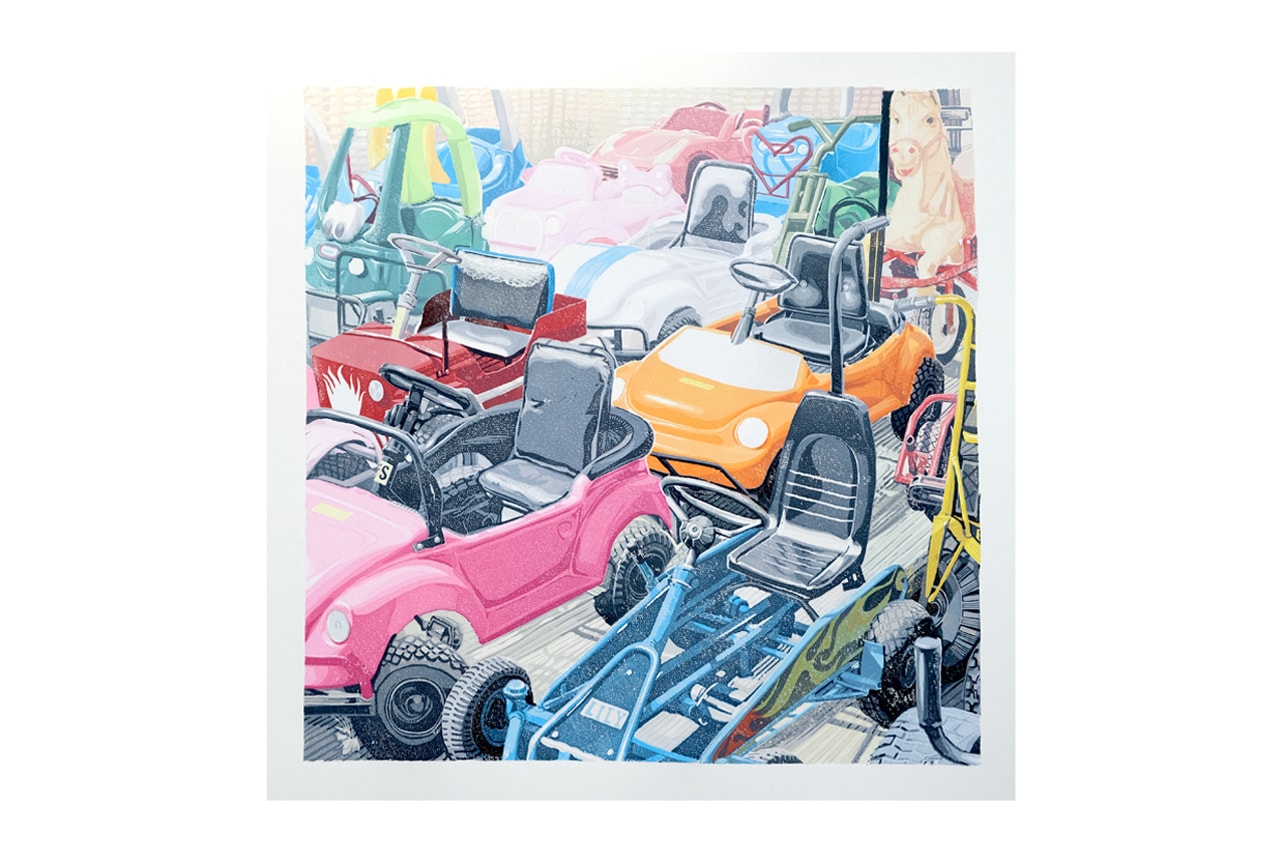
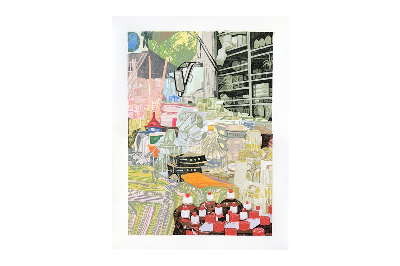
As well as realism, I’m really interested in saturation and excess. Often my work depicts products, people and materials packed together in close proximity and I like to contrast that with a muted palette so it’s not quite as aggressive. There are times I’ve been in Sports Direct and just stood around, taking in the sheer volume of similar clothing that’s hung up. It leaves me feeling so conflicted. There’s a large part of me that is absolutely fascinated by the scale of that many objects in one place, but conversely, I’m left thinking about the planet, and the footprint that must have. I try to keep things light if I can, and so my work tends to focus on the aesthetics of that, but maybe that will change in the future.
How long does it usually take to create a print? Walk us through your process of creating an artwork — from first thought to final execution.
It always starts with a photograph that I’ve taken, that’s my only rule. After deciding on an image, I’ll usually sleep on it and then finalize the composition the next day in Photoshop. I then project the chosen photo in reverse onto a wall and set about transferring that onto a slab of lino using a marker.
Up until the summer of 2023, I drew the images out painstakingly by hand. Once there’s a detailed outline, I spend a little time identifying which neighboring objects within the composition share similar colors and I pair these accordingly in my head in preparation for the next stage.
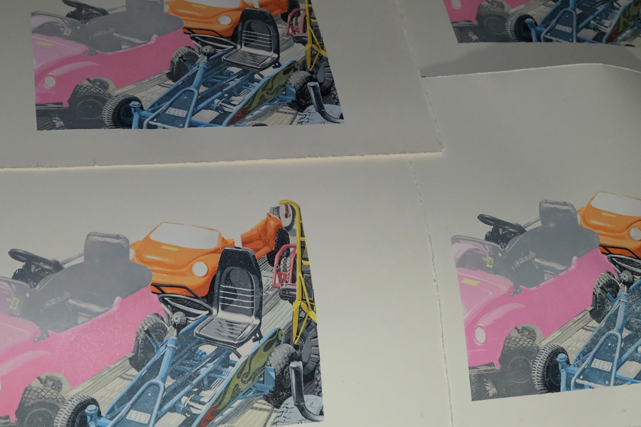
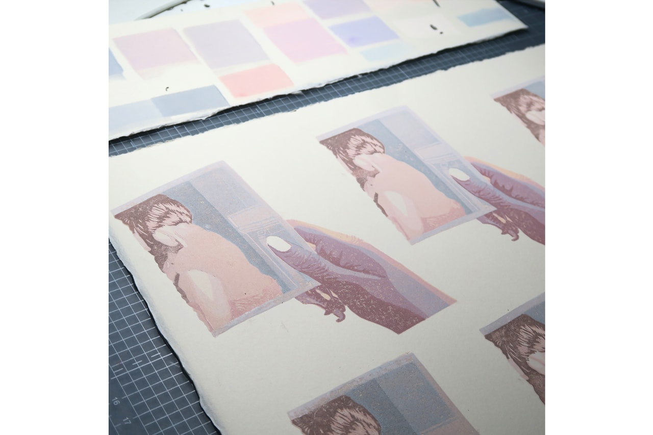
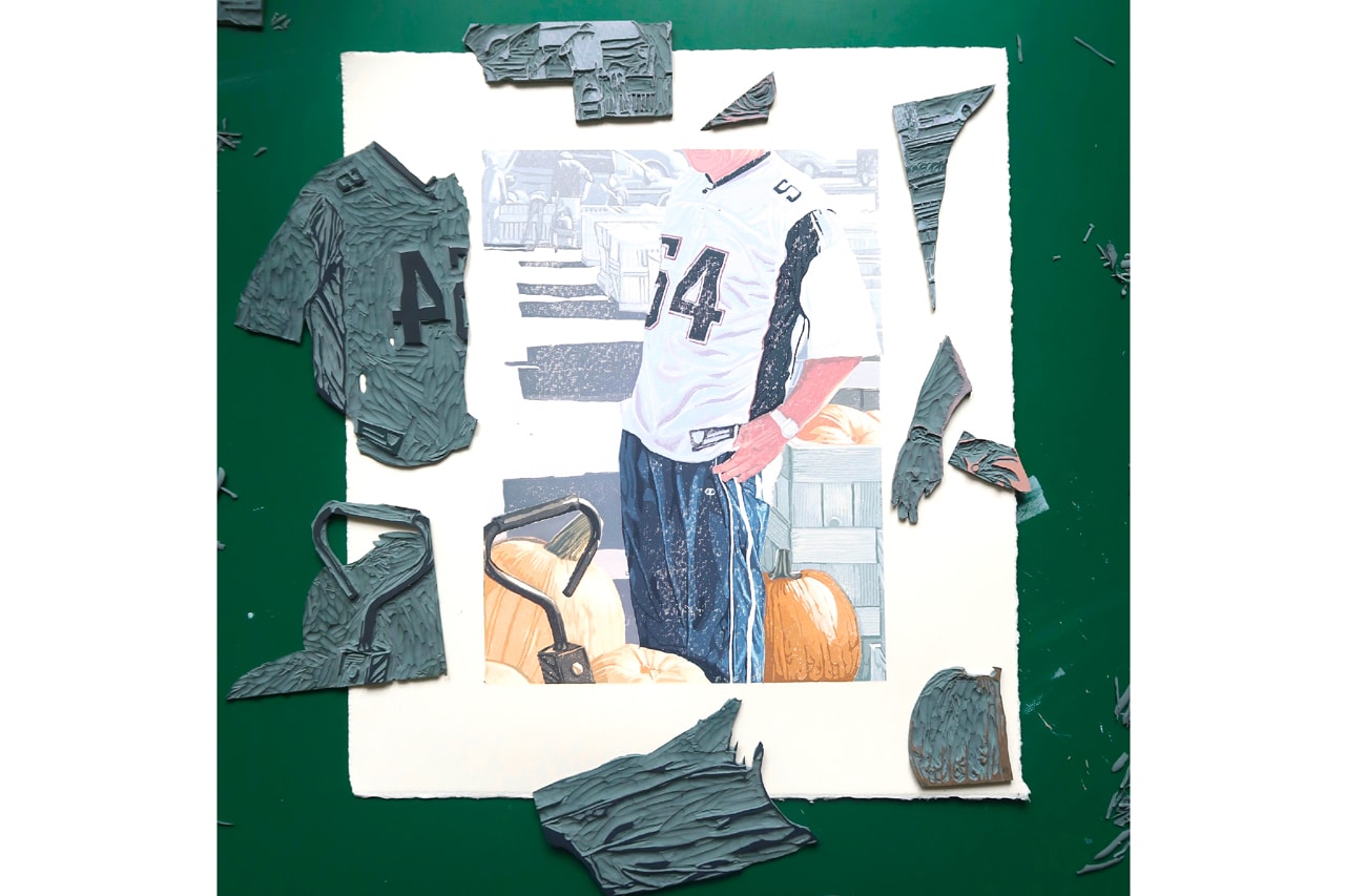
From here, I take a craft knife and carefully begin to separate the image into components until I’m left with many pieces, resembling a jigsaw in front of me. Treating each of these as its own tiny linocut, I subsequently begin the long and lonely process of printing them back together into their original order, one by one.
“Nothing’s really off limits anymore and that’s a very liberating feeling.”
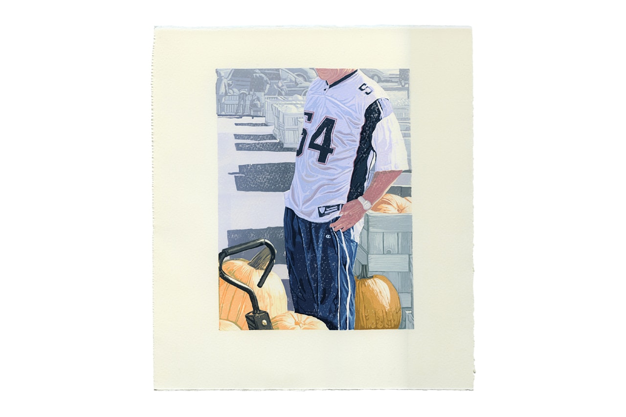
What is your process in choosing the compositions you create? For example, there is an image of a man wearing a New England Patriots jersey or another showing a group of people looking out in the distance, some of are holding camcorders and iPhone cameras. What about these images that speak to you and are they semi-autobiographical
It really is just an inherent feeling, and I think it becomes easier to trust it as you make more work. The jigsaw approach I use really lends itself to depicting maximalism, so my lino-sense starts to flash whenever I see very little negative space and a clash of materials.
The two you’ve selected are outliers, really. I made those prints to cheer me up during lockdown when I wasn’t so well. Patriot guy primarily made the cut because I wanted to illustrate his shiny polyester jersey and trackies, they’re box office. But I felt a pang of sadness there, too — despite the image’s sunny complexion. Generally, I tend to remove myself from the prints I make, I like them to exist in a parallel universe.
Over the past few years, animation has also been a frequent exploration of yours. Can you expand further on why you’ve dabbled into motion and how it’s affected the type of art you create today?
Despite my ties to lino, video and stop motion were actually my preferred mediums at uni but I felt they were too niche to move forwards with. I re-introduced animation into my practice in 2017, however, as an outlet for my passion projects and personal work. After graduating, all of my ideas were funneled into singular, static linocuts by default as that was all I had ever practiced. I became increasingly dissatisfied by this though, as many of them simply didn’t translate into a 2D square. The more I reflected on methodology, the clearer it became that they would benefit from sound and space.
It feels like I gained a new language in some respects, as before I felt quite stunted with what I could say or depict. Nothing’s really off limits anymore and that’s a very liberating feeling.
What have been some of your favorite projects you’ve worked on and why? Both passion projects and commissioned.
The work I produced through Vice for Volvo in late 2020 is very important to me, that first lockdown period is still so vivid. I think holistically it fit rather well and captured the sensitivity of the subject matter. That’s probably the work that people reference the most when commissioning me.
There was so little time and it was one of those rare jobs where everything seemed to get the green light pretty quickly. I would take calls during the morning and then wheel myself over to my partner who worked in a little make-shift alcove behind a curtain hung from a shower rail. From there, I’d carve solidly sat beside her through to midnight each day.
What are some new projects or exhibitions you are currently working on?
I’m applying the finishing touches to my portfolio right now in the hope of getting some representation in the near future. Additionally, I’m also in the midst of producing a new lino series, with some larger scale prints lined up. If it all goes to plan, that body of work will form my first solo exhibition at some point later next year.
Who would a dream collaborator for you be?
I’ve dreamt of working with Apartamento Magazine in some capacity for almost a decade now. I’m biding my time. I think their art direction is *chef’s kiss* – if that happened, I’d be made up. I think the way I layer ink is especially effective at depicting skin tone and material, so I’d love to tackle some fashion illustration in the future. GAP, Marc Jacobs, Rowing Blazers, I’m not picky.
All artwork courtesy of Dan Howden for Hypeart.


