Samuel Ross Shares His Thoughts on Collaborating With Acqua Di Parma
The award-winning designer goes into details about the design and product development process for the “Colonia Limited Edition” in an exclusive Hypebeast interview.

Samuel Ross Shares His Thoughts on Collaborating With Acqua Di Parma
The award-winning designer goes into details about the design and product development process for the “Colonia Limited Edition” in an exclusive Hypebeast interview.
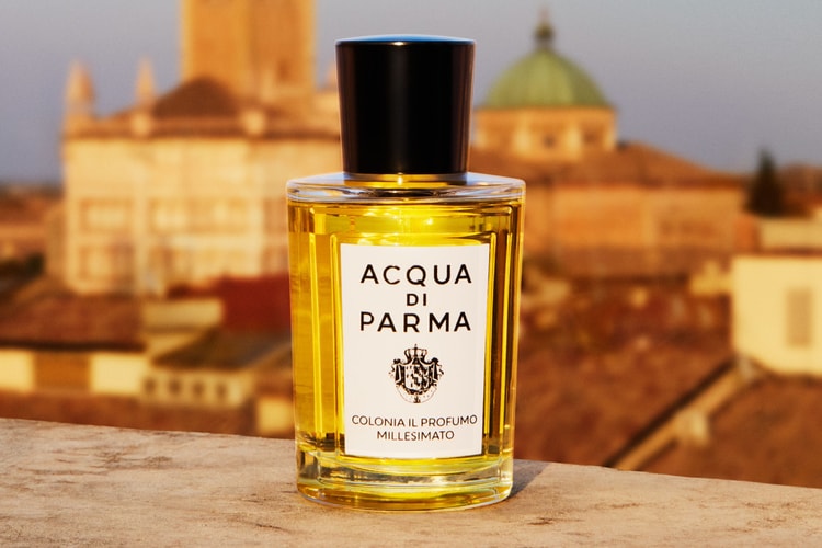
Acqua di Parma just announced the reimagining of its signature fragrance in collaboration with Samuel Ross. Aptly named Colonia Limited Edition, designed by Samuel Ross, the release comprises three colors: Sun_Rise_Yellow, Grass_Blade_Green, and Ultra_Orange, all of which are rendered in their respective hues, providing a refreshing update to Acqua di Parma’s usual aesthetics.
With a rich history in luxury fragrances, Acqua di Parma is a symbol of Italian savoir-faire and refinement. On the other hand, Samuel Ross is a young British designer acclaimed for his thought-provoking art and industrial design. One might wonder how the two parties, both seemingly far-fetched in terms of style and demographics, have come together in this refreshingly unprecedented collaboration.
“Their typography and choice of colors made me notice their concession in Selfridges,” the A-COLD-WALL* founder recalls on his first impression of the luxury Italian label. “The consistency across their collection and branding felt controlled, minimal, and well-considered. I then became familiar with their product range through browsing and trying out products in their mono-stores as well as their Selfridges concession.” Even before becoming acquainted with Acqua di Parma, Ross admits that he has respected the Maison for quite some time. “They have built a work dynamic that balances the tension between preserving tradition and expanding into the new.”
“It’s far more organic to build a connection with a potential collaborator who shares a similar perspective.”
The designer’s first time working with Acqua di Parma was when the brand provided their scents for Ross’ Hublot Big Bang Tourbillon installation. “From there I connected with Paola, the Maison’s nose, and we quickly bonded over our mutual sensibilities.” Ross elaborates that “It’s far more organic to build a connection with a potential collaborator who shares a similar perspective — it’s a meeting of different generations that holds a similar expectation for what detail and craft should consist of.”
When asked about his thoughts on collaborating with such a historical name, Ross says that “It’s been insightful to open the first chapter of the partnership – there’s a shared desire to jolt the Maison.”
According to Ross, the process of reimagining Acqua di Parma’s signature fragrance has been a rigorous one. Due to his obsessive nature with detailing, a huge amount of the initial planning stage went toward prototyping. For this, the designer was thankful for the Maison’s trust and understanding of his creative process, as “not all partnerships or product developers care to this degree.”
Some of the main challenges Ross has faced in reinterpreting such an iconic product was identifying the various areas in which he can experiment. “Our first product run was merely an introduction to the partnership. We focused as much on the bottle’s refinements, as we did on the impact Acqua Di Parma has in a physical space through store design, campaigns, and installation.”
For the bottle’s design, Ross’ focus was on reduction, specifically, reducing the original labeling system. “We built our own typeface and numbering system by introducing flat primary colors. The colors reflect the architectural work of Renzo Piano and Richard Rogers, which acts as a summary of the connection between European cities. The thought of frameworks, scaffolds, and temporary facades are also filtered into the product’s industrial design language.” From then, the designer ensured that all intricacies were considered, “from the temperature of an image in correlation to the notion of sunrises, to the silhouette of the bottle, and the fragmenting of the type that occurs when looking through the bottle.”
As to what shaped Ross’ choice to explore the connection between European cities for the design, he explained that it was due to the amount of time he spent working back and forth between his London studio and Milan-based atelier. “Moving between the two cities so frequently really made me notice differences and similarities between urban planning.” The influences were evident – while Acqua di Parma’s iconic Art Deco-style bottle remains, they have been rendered in hyper-flat and ultra-pigmented hues that nod to London’s urban and Brutalist aesthetics. The product’s colors were adjusted several times in order to resonate with the image of nature each perfume conveys.
When asked about whether there’ll be more collaborations with Acqua di Parma to come, Ross answered, “We have a clear road map of what we’re looking to communicate over the next few years. The environment is key. Hyper-visual is also key.”
As an ode to cross-border creativity, the collection will be unveiled in a series of international retail spaces designed by Ross’ studio, SR_A, and Acqua di Parma. To commemorate the launch, 300-piece special-edition collector bottles will be available at Selfridges London and select Acqua di Parma stores today. Each in-store purchase will be accompanied by an art publication with exclusive visuals and behind-the-scenes that contributed to the fruition of this collaboration. The Colonia Limited Edition, designed by Samuel Ross will be globally available via Acqua di Parma’s official website, starting from March 15.
Elsewhere in fashion, La Nausée is taking over Bone Soda’s DIJONSS store with an archival designer “BAZAAR.”


